

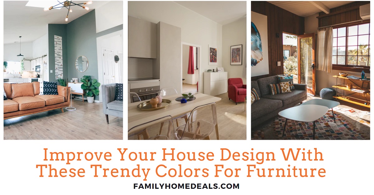
Thinking of renewing your space? Maybe you’re renovating, redecorating, or simply want to freshen things up. Choosing the right furniture color can transform a room more than you might expect—it sets the mood, defines style, and (done well) lasts through changing fashion. In 2025, we’re seeing some exciting directions in colors that are not only beautiful but responsive to how people live, feel, and connect with their surroundings. Below are the Trendy Colors For Furniture with up-to-date examples, actionable tips, and ideas to help you pick colors that will still feel fresh a year or more from now.
What’s Driving Color Trends
Before diving into specific hues, it helps to understand the cultural and design currents shaping color choices right now:
-
Desire for Comfort & Well-Being: After years of fast change (pandemic, work from home, economic pressures), people want homes that feel safe, calm, and nurturing. Colors that soothe or bring warmth are in high demand.
-
Sustainability & Natural Inspiration: Materials and colors drawn from nature — organic woods, clay, stone, foliage — are more popular. Earthy tones remain strong.
-
Boldness and Self-Expression: At the same time, there’s a counter-trend: people want color accents, artistic pieces, playful or bold statements in their homes. It’s no longer just about “neutral safe” tones.
-
Blending Old & New: Retro, vintage, or mid-century styles are being reintroduced, but mixed with modern design and technology. So color comes tied to shape, texture, and juxtaposition.
With those forces in mind, here are the furniture color trends to know — and how to use them well.

Top Furniture Color Trends for 2025
Here are the color palettes making waves this year. Each comes with what works, what to watch out for, and inspiration on how to blend them into your home.
| Color / Palette | Why It’s Trending | Where & How to Use It | Tips & Examples |
|---|---|---|---|
| Soft Yellows & Warm Creams | Designers are replacing stark white with warm, gentle yellows or cream tones. These act neutral but with more warmth and personality. | Ideal for furniture with a larger surface area: sofas, buffets, cabinets. Also good for trim, woodwork, or built-ins to feel softer. | Pair with wood tones (oak, walnut), muted greens, and terracotta for contrast. A cream-yellow sideboard with brass hardware can feel luxurious; a pale butter-yellow chair adds sunshine without being overwhelming. |
| Earthy Greens & Olive Tones | “Sage,” olive, moss, and deeper leafy tones are serving as new neutrals. Rooted in biophilic design and natural living. | Best in accent furniture (chairs, ottomans), kitchen cabinets, or upholstery. Works especially well in rooms with lots of natural light to show depth. | If you have dark wood flooring, use olive upholstered chairs or green throw cushions to tie in. Use finishes that are matte or slightly textured so light plays on the surfaces. Avoid color clashing by anchoring with a neutral (beige, stone, or sandy tone). |
| Deep Reds, Terracottas, Oxblood & Burgundy | Rich red shades are back as accent colors that bring warmth and character. Terracotta and clay tones are especially trendy, conveying grounded energy. | Use sparingly for maximum effect: maybe one sofa, a statement chair, or small furniture like side tables. Also in decor items — lamps, cushions, or statement legs. | Maintain balance: warm reds pair beautifully with creams, soft yellows, or muted greens. Example: a terracotta lounge chair against a pale wall, with accent pillows that include gold or deep green. Use materials that absorb light (velvet, suede) to enrich the color. |
| Jewel & Statement Blues / Purples | Blues (both deep and bright) and purples are being used as punches of color. Yves Klein blue or rich royal tones, plus shades of aubergine/mulberry, are rising. | Best for accent furniture or spaces you want to feel dramatic (e.g., library, dining room). Blue sofas, armchairs, or cabinetry can make a bold impression. | If your room is small, use a jewel tone in one piece and keep the surroundings softer. Metallic accents like brass/silver go well. Plush fabrics like velvet or silk amplify the richness. Be careful: low lighting can mute these colors, so ensure sufficient natural or artificial light. |
| Neutrals Reimagined: Cream, Taupe, Greige, Warm Grays | Not all neutrals are created equal — there’s a shift toward greige (gray + beige), warm grays, and creams that feel more inviting. These are safe bets but with more personality. | These are great for large/expensive pieces: sofas, large cabinets, shelving units. Also ideal for multi-functional furniture since they blend with many styles. | Choose finishes that resist visible wear (texture, matte), especially in high-use items. Balance with small color accents so the room doesn’t feel sterile. Example: a greige sectional with throw blankets in terracotta or soft yellow. |
| Natural Wood and Honey Oak Finishes | Wood tones are being celebrated more, especially mid-tone woods like honey oak and natural oak. Their warmth complements many color trends and helps bring in that connection to nature. | Use in furniture frames, legs, tables, and cabinetry. Also, as decorative inlays or small wooden accent furniture. | Look for matte or satin finishes (not glossy) to feel modern. Combine wood tones with metal accents for contrast. If mixing woods, keep them in the same tone family (warm vs cool) to avoid visual clash. |
| Accent Pattern, Floral, and Texture | Solid color is still strong, but pattern — especially florals, botanicals, and graphic prints — is making a comeback on upholstery and accent furniture. Texture (velvet, ribbed fabric, boucle) also plays a big role. | Use on smaller pieces or cushions to test comfort with boldness. An accent armchair in floral print, or a patterned ottoman, can animate a space. Also, embedding texture in fabrics adds depth. | If the pattern is bold, set it against neutral furniture/textiles. Consider scale: large prints in big rooms; smaller prints or subtle textures in compact spaces. Mix texture (e.g., smooth leather + nubby fabric) for tactile richness. |
Notable Trendy Colors f0r Furniture
1. Vibrant Color + White / Light Backdrops
Original idea: Bright furniture set against white walls.
Today, instead of pure white, many people are choosing light warm neutrals (off-white, cream, light buttery yellow) as the backdrop, making vibrant furniture pop without a harsh contrast.
How to use:
-
Choose one or two bold furniture pieces (sofa, lounge chair, sideboard) in vibrant shades like red, teal, or orange.
-
Use walls and trim in warm neutral tones to reduce glare and make spaces feel cozy.
-
Add white elements (cushions, small tables) to tie in the lightness without going all-white.
Example: A deep turquoise sofa against cream walls, with white cushions and natural wood side tables.
2. Nostalgia & Mid-Century / Retro Styles
Original: 1950s/60s charm, bright & earthy colors.
Now: Mid-century design is more mixed—retro shapes (rounded forms, tapered legs), vintage finishes, but integrated with modern function. The color palette includes terracotta, deep mustard, muted greens, and chocolate-y browns.
How to bring it in:
-
Choose one retro focal piece (e.g., a mid-century credenza, a 60s-inspired lounge chair).
-
Incorporate vintage lighting or hardware (brass, geometric lamps).
-
Use retro color combos: olive + mustard, burnt orange + brown + cream.
Example: A retro wooden buffet in walnut, with tapestry cushions in mustard and green on an otherwise modern sofa.
3. Earth & Nature-Inspired Palettes
The original talked about beige, gray, natural wood, etc. That remains very much true — even more so, given global shifts toward sustainable living.
Key colors: Olive green, terracotta, stone gray, warm brown, rust, and deep forest green. Mix with natural textures: wood, rattan, linen, and clay.
Actionable tip: If you can, source furniture made from sustainable materials: FSC-certified wood, reclaimed wood, bamboo, or recycled metals. Not only colors but the material’s origin contribute to the “natural” feel.
4. Shades of Luxury
Original: Black, purple, metallics, etc.
Luxury is expressed more subtly. Rich tones of deep jewel tones (aubergine, mulberry, oxblood, midnight blue) are being used with sumptuous textures (velvet, silk, polished metals). Metallic accents remain — brass, gold, aged bronze — but typically not overdone.
Use them for drama: A deep blue velvet sofa, a plush purple accent chair, or an oxblood leather armchair. Let these pieces anchor the room; then use subdued neutrals around them so the room feels balanced.
5. Minimalist / Light Color Present
The minimalism idea is still alive — but it’s softened. Rather than stark, clinical white and cold grays, the minimalist palette is now leaning toward warm neutrals, softer whites, creamy off-whites, light beiges, and taupes. The forms are clean, surfaces uncluttered, but textures (soft throws, matte wood) are used more.
If you love minimalism, focus on:
-
Furniture with clean lines but interesting textures.
-
Let quality show: well-made joints, good upholstery.
-
Accent sparingly with color or texture so that the minimalism feels intentional rather than bare.
Enjoy the Xcaret.com offers and plan your vacation!

Made for tourists seeking to immerse themselves in the wonders of the Mexican Caribbean. From exploring underground rivers and snorkeling in coral reefs to experiencing traditional Mexican dance performances and wildlife exhibits, Xcaret offers a unique blend of natural beauty and cultural heritage. For detailed visitor guides, ticket booking options, and information about accommodations, seamless travel adventures, visit xcaret.com today!
Practical Steps to Choose the Right Furniture Colors for Your Space
Here’s how to make these trends work for your home — adapt, don’t mimic.
-
Assess Your Lighting
Natural and artificial light affect color significantly. South-facing windows make colors warmer; north-facing windows can make them cooler. Test paint or upholstery swatches in the actual lighting at different times of day. -
Account for the Size & Function of Furniture
Large pieces (e.g., sofas, dining sets) commit you more. For these, go safe with neutrals or tones you love deeply. Use smaller accessories (throw pillows, side chairs) or movable pieces to experiment with trendier / bolder colors. -
Start Small with Accents
If you’re hesitant, try adding color via pillows, rugs, or small furniture. If you love it, you can commit more. -
Balance is Key
Too much bold color can feel overwhelming. A good rule: 70-20-10: 70% neutral/grounding colors, 20% secondary tones, 10% accent (bold or flamboyant). That gives harmony while allowing statement elements. -
Consider Material & Texture
A color looks different on matte wood, glossy lacquer, or plush velvet. Texture can soften or sharpen a color’s effect. Using natural textures (wood grains, woven fabrics) helps grounding bold hues. -
Think Long Term
Trends are fun, but furniture is a long-term investment. Choose hues you enjoy over time, or pick trend colors for smaller or replaceable items. -
Test & Visualize
Use virtual room renderers or buy small swatches/sample chairs. Live with them (move them around) before making a big purchase.
Which Colors to Avoid (or Use Carefully)
-
Overly Stark Whites without warmth. They can feel cold or clinical unless balanced with warm accents.
-
Trendy Neon / Ultra Brights in large furniture surfaces — unless you love them; they age quickly, may clash, or dominate a room in an undesirable way.
-
Very Cool Greys / Blues in poorly lit spaces — they can drain color and mood.
Examples to Inspire You: Real-World Combos
-
“Sunset Living Room”: A deep terracotta sofa, cream-yellow accent chair, natural wood coffee table, potted plants, and gold hardware. Warm, inviting, with that boho-glam feel.
-
“Vintage Mid-Century Study”: Olive green armchair, mustard yellow throw, walnut bookshelves, geometric patterned rug. Mix of old and new.
-
“Modern Luxury Lounge”: Midnight blue velvet sectional, brass floor lamp, marble side table, neutral stone or taupe walls; textured rug to soften edges.
Color Forecast Highlights & Predictions
-
Accent reds (cherry, oxblood) will continue gaining strength.
-
Muted, nature-inspired tones (greens, browns, rust) will dominate overall palettes, especially for upholstery.
-
Jewel tones paired with warm neutrals will be especially popular — they add depth without overwhelming.
-
“Color drenching” (using one color broadly: walls, furniture, ceiling) remains appealing in certain applications like smaller rooms, powder rooms, or for dramatic effect. But moderated use is preferred.
Bringing It All Together: Harmonious Design Tips
-
Create a mood board: Collect images, fabric swatches, and paint chips. See what tones recur, and how lighting influences them.
-
Anchor with neutrals: Big pieces + flooring + major walls generally do well when kept in neutral-warm tones; then add personality with accents.
-
Use contrast smartly: Light vs dark; warm vs cool; matte vs glossy. Contrast helps to define furniture shape and highlight craftsmanship.
-
Let color tell a story: Perhaps a favorite trip, favorite natural landscape, or cultural influence—a color or palette anchored in personal meaning tends to feel timeless.
Conclusion
2025 isn’t about forcing your home into a specific “trend” box—it’s about choosing colors that reflect well-being, warmth, and personality. We’re seeing:
-
a rise in warm neutrals and reimagined creams instead of stark whites;
-
bold accent colors like reds, terracottas, olives, jewel tones used more deliberately;
-
Nature and texture play equally important roles in every piece.
By balancing boldness with comfort, using accent pieces to experiment, and anchoring your design in meaningful colors, you’ll create a space that feels current and timeless.
Here’s to your home becoming not just stylish for 2025, but a space where you feel happy, grounded, and inspired.