

A fresh coat of paint can completely change the way a home looks and feels. Good house painting adds warmth, personality, and value, while poor paint choices can make even expensive homes look unfinished or outdated. Recent design reviews and home improvement reports show that homeowners are paying closer attention to color quality, finish, durability, and curb appeal than ever before. Warm neutrals, earthy greens, soft charcoals, and natural textures are becoming more popular as people move away from cold, overly sterile interiors.
At the same time, design experts continue to highlight one major issue that is often overlooked. Many homes still suffer from basic paint mistakes that instantly reduce their visual appeal. Some problems stem from poor preparation, while others result from trendy choices that age poorly. A paint job should make a home feel clean, polished, and inviting. Instead, certain decisions can create the opposite effect.
Here are the biggest house painting mistakes that make homes look cheaper than they really are, and what can be done instead.
10 House Painting Mistakes Killing Your Home’s Look
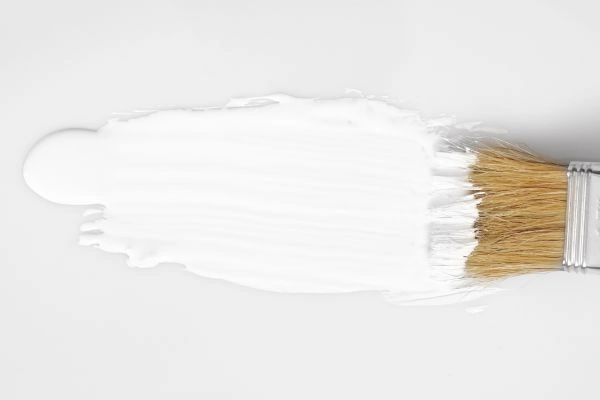
1. Choosing The Wrong White Paint
White paint sounds simple, but it is one of the hardest colors to get right. Bright, icy whites may look clean in a showroom or on social media, yet they often feel harsh and lifeless inside real homes. Designers have recently noted a major shift toward softer whites with cream, linen, or warm mineral undertones.
One of the most common mistakes is choosing ultra-bright white without considering lighting. Natural daylight, warm bulbs, and shadows can completely change how white paint appears on walls. What looked crisp in a paint sample can suddenly appear blue, gray, or even clinical once applied across an entire room.
Soft warm whites tend to create a more inviting atmosphere. They also complement wood flooring, textured fabrics, and contemporary design styles that emphasize comfort rather than minimalism.
Exterior house painting faces the same problem. Stark white exteriors can feel flat and glaring under strong sunlight, especially in tropical or coastal areas. Warm whites often age better visually and help create a more timeless, lasting aesthetic.
2. Ignoring Surface Preparation
Many cheap-looking paint jobs have nothing to do with color. The real issue is poor preparation.
Painting over dirty walls, peeling paint, cracks, or uneven surfaces almost always leads to disappointing results. Even premium paint cannot hide bad prep work. Professionals consistently stress that preparation often matters more than the actual painting itself.
Skipping sanding, patching holes, or cleaning walls can create rough textures and visible imperfections. Exterior surfaces deteriorate further when mold, moisture, or old, flaking paint are ignored before repainting begins.
Preparation also affects durability. Paint applied to dusty or damaged surfaces tends to peel, bubble, or crack much more quickly. That creates a worn appearance that can make an entire property feel neglected.
Good house painting starts long before the first coat goes on. Clean surfaces, smooth walls, repaired cracks, and quality primer make a huge difference in the final result.
3. Using Too Many Colors At Once
Color variety can add personality, but too many competing shades often create visual chaos. Designers have recently warned against overcomplicated exteriors filled with excessive materials and mismatched paint colors.
Some homeowners try to make every room feel unique by using completely different palettes throughout the house. The result often feels disconnected and smaller than it actually is.
Exterior painting can become even more problematic. A home with several unrelated colors on siding, trim, doors, and accents can quickly lose its architectural identity. Instead of looking stylish, the property starts feeling random and overwhelming.
Modern paint trends lean toward cohesive palettes. Earthy greens, clay tones, muted blues, and warm neutrals work well because they create flow between spaces without feeling repetitive.
Consistency does not mean everything must match perfectly. It simply means that colors should complement one another and support the home’s style.
4. Following Trends Without Thinking Long Term
Trends can inspire great design ideas, but unthinkingly following them often leads to regret. Several interior experts recently predicted that some overly trendy design choices will quickly feel outdated.
The same thing happens with paint colors.
A shade that looks exciting online may become exhausting after a few months. Bright reds, extreme blacks, neon colors, or overly trendy accent walls can quickly lose appeal. Some bold colors may even hurt resale value, according to recent housing reports.
This doesn’t mean bold colors are off-limits. Rich greens, warm browns, moody charcoals, and muted burgundy tones remain popular because they feel grounded and versatile.
The safest approach combines timeless base colors with smaller trend-driven accents. Pillows, artwork, furniture, or decorative pieces are easier to replace than repainting an entire home.
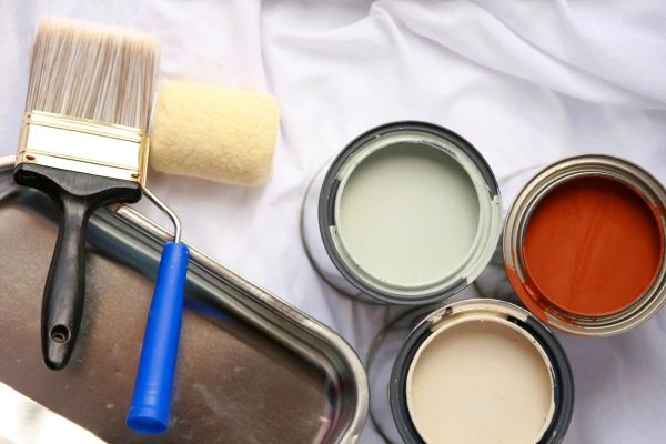
5. Choosing Cheap Paint Products
Low-quality paint may save money up front, but it often causes more problems later.
Cheap paint tends to require extra coats, fades faster, stains easily, and struggles to cover surfaces evenly. The finish may also appear dull or streaky once dry.
Major paint brands like Sherwin-Williams, Behr, Valspar, Benjamin Moore, and Dulux continue to dominate design discussions because of their durability, finish quality, and color consistency.
Better paint products usually contain stronger pigments and resins, helping colors stay richer for longer periods. They also resist peeling and moisture damage more effectively.
The finish itself matters too. Flat finishes can hide wall imperfections but may stain easily. High-gloss finishes reflect more light yet can expose flaws on uneven surfaces. Satin and eggshell finishes remain popular because they balance softness with durability.
6. Forgetting About Lighting
Lighting changes everything in house painting.
A color that looks warm and cozy during the afternoon may appear dull or greenish at night. North-facing rooms often feel cooler, while south-facing spaces receive warmer natural light.
This is why paint samples should always be tested directly on walls before making a final decision. Experts increasingly recommend observing paint colors throughout different times of day before committing.
Exterior colors also react differently depending on sunlight, weather, and surrounding landscaping. Some shades become dramatically brighter outdoors than expected.
Ignoring lighting often leads to expensive repainting projects later. Testing large sample sections first can prevent major disappointment.
7. Poor Exterior House Painting Choices
Curb appeal matters more than many homeowners realize. Real estate professionals continue to emphasize how exterior paint colors strongly affect buyer impressions and overall property value.
One of the biggest exterior house-painting mistakes is choosing colors that clash with the architecture or environment. A modern black-and-white palette may look stunning on one property but completely out of place on another.
Design experts now encourage homeowners to work with, rather than against, natural surroundings. Earth-inspired shades such as sandstone, olive green, clay beige, muted charcoal, and warm greige remain especially popular because they blend well with landscaping and natural materials.
Another common mistake is ignoring smaller details like trim, shutters, pathways, garage doors, and lighting fixtures. Exterior design works best when every element feels connected.
Even the front door plays a huge role. A well-painted entry door can add character and sophistication without requiring a complete repaint of the home.
8. Skipping Primer
Primer may not seem exciting, but skipping it can ruin an otherwise beautiful paint job.
Primer helps paint adhere properly and creates a smoother surface. It also blocks stains, seals porous materials, and improves color consistency.
Without primer, darker wall colors may bleed through lighter paint. Uneven textures become more visible, and the final finish can look patchy or thin.
This mistake becomes even more obvious during dramatic color changes. Painting beige walls directly with white or deep navy without primer usually results in uneven coverage that requires extra coats.
Primer also extends paint’s life, especially in humid climates where moisture issues are common.
9. Overusing Accent Walls
Accent walls once dominated home design trends, but many designers now see them as overused when applied poorly.
The problem is not the accent wall itself. The issue stems from random placement or overly aggressive colors that disrupt the room rather than enhance it.
A single dark wall in a small room can make the space feel awkward and unfinished. Bright feature walls can also create a dated look if they rely too heavily on short-lived trends.
Modern interiors increasingly favor color-drenching and cohesive tones instead. This approach uses related shades throughout the room to create a richer and more balanced atmosphere.
When used carefully, accent walls should highlight architectural details or natural focal points rather than compete for attention.
10. Ignoring Texture And Finish
Color matters, but texture and finish play an equally important role in how expensive a paint job looks.
Recent design trends show growing interest in tactile surfaces, layered finishes, and natural textures that create warmth and depth.
Walls with completely flat, lifeless finishes can sometimes make spaces feel cold and unfinished. On the other hand, overly glossy walls may create harsh reflections that expose every imperfection.
Modern homes increasingly mix finishes to create dimension. Matte walls combined with satin trim or textured surfaces help rooms feel more polished and intentional.
Decor trends also support this shift. Warm woods, stone materials, velvet fabrics, and vintage-inspired textures continue to grow in popularity, adding character and softness to interiors.
Paint should complement these textures rather than compete against them.
11. Painting Without Considering Resale Value
Personal taste matters, but resale value should still be part of the conversation.
Some homeowners choose highly specific colors that appeal only to a narrow audience. While there is nothing wrong with creative expression, extremely bold palettes may limit future buyer interest.
Housing reports continue to show that certain colors perform better in resale situations. Deep olive greens, navy blues, dark grays, and warm neutrals are often viewed as sophisticated and modern. Meanwhile, bright yellow and intense red shades may reduce buyer appeal.
Neutral does not have to mean boring. Warm taupe, mushroom tones, clay beige, and muted greens offer personality while still feeling broadly appealing.
The goal is balance. Homes should feel lived-in and welcoming without becoming too visually overwhelming.
Why Modern House Painting Trends Feel More Natural
One noticeable shift in current home design is the move toward comfort and authenticity. People are increasingly moving away from cold gray interiors and overly staged spaces. Instead, homes now lean toward earthy palettes, softer textures, and colors inspired by nature.
This explains why warm greens, browns, clay tones, and muted blues continue to dominate discussions about paint. These colors feel calm and adaptable rather than trendy for the sake of attention.
Vintage influences are also returning in a more refined way. Rich wood tones, aged finishes, and layered textures help homes feel collected and personal instead of overly polished.
House painting now focuses less on creating showroom-perfect finishes and more on creating spaces that feel welcoming in everyday life.
Frequently Asked Questions
- What Is The Most Common House Painting Mistake?
One of the most common house painting mistakes is skipping proper wall preparation. Painting over dirty, cracked, or uneven surfaces can lead to peeling, bubbling, and uneven finishes. Clean walls, sanding, patching holes, and applying primer help create a smoother, longer-lasting finish.
- Which Paint Colors Make A Home Look Expensive?
Warm neutrals, soft whites, earthy greens, muted charcoal, and greige tones are often associated with high-end interiors. These colors create a clean, timeless look that works well with different lighting conditions and furniture styles.
- Does House Painting Increase Home Value?
Yes, quality house painting can improve curb appeal and increase perceived home value. Fresh interior and exterior paint makes homes look cleaner, newer, and better maintained, which can attract more buyers and create stronger first impressions.
- How Often Should Exterior House Painting Be Done?
Most exterior paint jobs last between 5 and 10 years, depending on the climate, paint quality, and surface material. Homes exposed to strong sunlight, humidity, or heavy rain may require repainting sooner to prevent fading and moisture damage.
- Is Expensive Paint Worth It For House Painting?
Higher-quality paint is usually worth the investment because it offers better coverage, durability, color retention, and resistance to stains or peeling. Premium paints often require fewer coats and last longer, helping reduce maintenance costs over time.
Creating a Timeless Home
Paint can completely transform a home’s mood, style, and value. A well-planned paint job can make spaces feel cleaner, brighter, and more polished, while poor color choices and lack of preparation can make even beautiful homes look outdated or rushed.
Today’s trends focus on warm, timeless colors like earthy greens, soft whites, and muted charcoals that create comfort and character. In the end, successful house painting is not about following every trend, but choosing colors and finishes that naturally fit the home and provide lasting appeal.